
So what is this about? Straight for their website:
"Some of science's most powerful statements are not made in words. From the diagrams of DaVinci to Rosalind Franklin's X-rays, visualization of research has a long and literally illustrious history. To illustrate is to enlighten.
How many people would have heard of fractal geometry or the double helix or solar flares if they had been described solely in words? In a world where science literacy is dismayingly rare, illustrations provide the most immediate and influential connection between scientists and other citizens, and the best hope for nurturing popular interest. Indeed, they are now a necessity for public understanding of research developments.
The National Science Foundation (NSF) and the journal Science created the International Science & Engineering Visualization Challenge to celebrate that grand tradition--and to encourage its continued growth. The spirit of the competition is to communicate science, engineering and technology for education and journalistic purposes."
Their homepage is here.
Archive of winning entries dating back to 2003 is here.
Well worth having a look if you don't feel like watching the video or if you want more.
Of course, the concept itself is awesome, but one of the many things I really like about these, is the way they demonstrate that aesthetic beauty can be found beyond the scope of what is commonly accepted as such. Science is undoubtedly one of the many ways an observer can achieve a different appreciation of the world around us.
Oh, and I also dig how alien some of these shots seem.
Here are some of my favorites in no particular order (clicking on the captions brings up a popup telling you more about what the picture is):
 |
| Autofluorescence of Tick Nymph on a Mammalian Host Credit: Marna E. Ericson, University of Minnesota |
 |
| The Synapse Revealed Credit: Graham Johnson, Graham Johnson Medical Media |
 |
| Back to the Future Credit: Mario De Stefano, Antonia Auletta and Carla Langella; Second University of Naples |
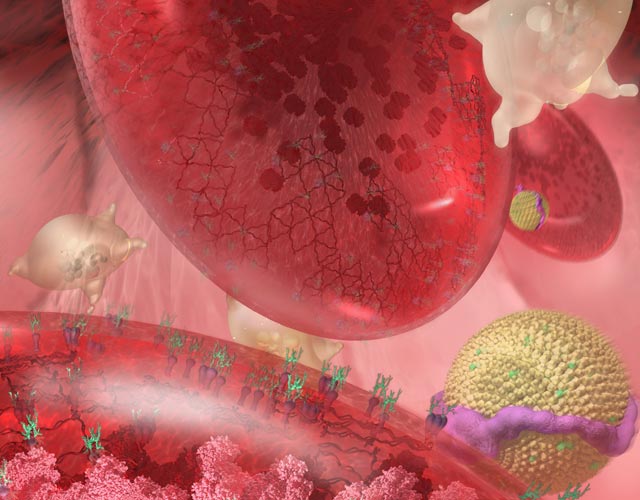 |
| Zoom into the Human Bloodstream Credit: Linda Nye and the Exploratorium Visualization Laboratory, The Exploratorium |
It's so true. Something that complex, innovative ideas...things outside the box. Imagery brings us so much closer to understanding. Thank you for sharing. Hope you are well :)
ReplyDeleteHello Annie, fancy meeting you here! It feels like I just bumped into you: I just read your latest musically promiscuous post. :D
ReplyDeleteIt's also fun to go beyond understanding and to... hmm..."beyond" makes it sound like a continuation along a line, and that's not right...
Hmmm, to take a big hop to the side and head off in a different direction.
I just wrote two pages outlining a science fiction story working from the basis that the first picture could be a representative of an alien race that "swim" like cuttlefish in a super dense gas giant and communicate with each other through modulated bio-luminescent signals. You could take the story several ways from there, like: "humans discover their existence through a scientific probe but fail to grasp their advanced intelligence and culture because of prejudice and because of how utterly alien their life-cycles and mores are" or "the aliens appear in our skies and do nothing but pulse pretty lights at us, hilarity ensues".
; j
I love these photos. I think they're part of my new religion.
ReplyDeleteHa, cool Kass! What does your new religion say about bagels, cakes, and rock'n roll? : j
ReplyDeleteThese things are among the main tenets - addressed weekly.
ReplyDeleteAmen! : D
ReplyDeleteI'm amazed about how microscopes, x-rays, and manipulation can make things like sinuses and microbes works of art. The Egyptian mummy was odd because the skull didn't match the face on the outside.
ReplyDeleteYou find the best stuff.
Heya Theresa, you're always so easy on me and tough on yourself. : j
ReplyDeleteThat struck Khnoum too, the mummy's face not lining up with the outside...
I wonder if they made the funeral mask that way because of esthetic reasons, or practical ones. Probably a mix of both.